Monday, 19 May 2014

LO 1 - Photographer Case Study 4 - Dan Boulton

Source: www.danboulton.com

Question: Why of all things in the world do you chose to photograph skateboarding?

Dan Boulton was born in 1973 in Enfield, North London. His work, which is mostly street photography has been featured in skateboard documents. A collection of his work is soon to be published as a limited edition book by Chicago-based Parking Block Publishing.


He uses a Leica M6, which is a 50 mm f/2 Summircron and liford HP5 film. All the work for his Southbank Project and show has been shot using this setup. He's strictly only uses that camera.

His style of photography ismainly black and white. One of his main themes is skateparks,.he likes to catch the skaters in action and like to watch what they do at the time.

Name: Southbank 42
Year: 2005 - 2011
Story: Southbank
This picture looks as if a race is about to start, probably to win something. You can see skaters getting ready to skate.


Name: Southbank 36
Date: 2005-2011
Story: Southbank
This picture gives off a dark effect. It's kind of mysterious and it may give an illusion that he is about to skate for a reason.


Name: Southbank 33
Date: 2005-2011
Story: Southbank
I like this picture as it shows good motion and not really blurry. It gives off the illusion that he is about to skate and the background works well with the setting.

Friday, 21 March 2014

LO1 - Blog Post 4 - Photographer Case Study 3 - Ansel Adams

Ansel Adams was born in 1902 and died in 1984. Most of his photos were publish into media such as calendars and books. Most of his photographs were taken in black and white but at times he'd photograph in colour. He particularly liked the Yosmite National Park in California, and created a portfolio in which made him popular and he got many assignments.

The visual style of Adams included such styles as 'straight photography'. This means that instead of soft focus and hand treatments, they were just straight photographs, to do this, he used view cameras.

Ansel AdamsGrand Tetons and the Snake River,
Grand Teton National Park, Wyoming, 1942
16 x 20"


This photograph includes a good range of mountains and also the Snake River. The sky could represent how full his life is by the way the clouds are filling up the sky.


Ansel Adams
Moonrise over Hernandez, NM
October 31, 1941


This photograph is different to the one above as it is taken at night rather than dusk and also in a different part of America which is rare for Adams to do. I think that he likes to take pictures of the moon/sun in particular as they have a certian brightnes that he probably likes.


Ansel Adams
Maroon Bells, Near Aspen,
Colorado, 1951
16 x 20" 

This photograph is taken in Aspen which has many good mountain ranges and which Adams likes to take pictures of rural landscapes.


Source: http://www.andrewsmithgallery.com/exhibitions/anseladams/anseladams/index.htm

Monday, 3 March 2014

Photography Evaluation Write-Up No. 5

Key Photograph No. 5

Section 1: Contact Sheet
The intention for this photograph was to be a screenshot from the film but eventually I got  a better picture so this wasn't needed anymore. I chose to have the school surrounding the sun on the left, bottom and right of the grid and the sun in the centre because with the look it came out with after the editing process it looked like a realistic sun blowing up.


Section 2:

The reason I chose this photograph is because it was just perfect positioning and timing. There are no people which make the photogrph look good and the sunlight is just inbetween the buildings and it shines perfectly across the school.


Section 3: Photoshop Edited Photograph


In this photograph I adjusted the curves to a lower level as well as the brightness and colour balance. It makes the sun look like it will explode.


Section 4: Framed Edited Photograph

Overall I am very pleased with the outcome of the photograph as it looks like an eclipse with the sun expanding as well. The lighting makes the scene look believable.

Photography Evaluation Write Up No. 4

Key Photograph No. 4

Section 1: Contact Sheet


The initial idea for this photograph was to be edited and put into the DVD box on the back cover. I chose to centre the actor at first and the in the final version I put the actor to the left as it looked more successful.

Section 2: Original Photograph

The reason I chose this photograph is because the reaction looks perfect as well as the hand positioning. As you can see above, I did many photos with this idea but this seemed more appropriate with the genre. This was well suited for the DVD as it specifies the action genre.


Section 3: Photoshop Edited Photograph

In this picture i adjusted the curves, brightness contrast and colour balance to a lower level at the picture I was photoshopping myself onto would be dark. I also used a poster edges filter.


Section 4: Framed Edited Photograph


I think this photograph looks very well considering the scene it was going to be put in in the movie was dark and I managed to darken myself as good as possible.


Section 5: Photograph and DVD Box

This contributes to the DVD box as
it shows a scene that happens in the
movie which most DVD boxes contain.

Friday, 28 February 2014

Photography Evaluation Write Up No.3

Key Photograph No. 3

Section 1: Contact Sheet

My initial plan was to include this photograph in my poster by it never looked right so I decided to scrap it. Originally the eye was going to be on the centre right box of the 9 square grid but again that didn't look right so I centred it.


Section 2: Original Photograph

This photograph was chosen because the eye is centred and looking towards the camera instead of looking to the left or right, which some of the pictures show.


Section 3: Photoshop Edited Photograph


On this photograph I adjusted the brightness, curves, colour balance and made it black and whit to give this tanned / greyscale eye. The adjustments give the photo more of a professional look.


Section 4: Framed Edited Photograph


I think this photograph is a beautiful piece as the resolution has stayed the same through the editing process and the iris of the eye really stands out. The lighting also gives off a professional look as the flash shows the shadow of the eyelashes.

Photography Evaluation Write Up No.2

Key Photograph No. 2

Section 1: Contact Sheet

This photograph was going to end up on the poster and being two more members of the cast. I chose to have the two in the centre of the frame because as they are part of the main cast. it would work well to have them in the centre rather than the left or right.


Section 2: Original Photograph


The reasons I chose this picture is because it shows the personality of the charcters so for example with Harvey (left), this shows that he's the 'laddish' type where as with Jon (right), this shows that he's more of a serious character.


Section 3: Photoshop Edited Photograph


I adjusted the brightness to a lower level, as well as the colour balance and the curves, which adjusts brightness also. I cropped the photograph so there wasn't much black background and made the two people take up the photo.


Section 4: Framed Edited Photograph


I am very pleased with the outcome of this photograph as the resolution stayed the same throughout to give a better quality and the lighting is just right and shows enough. The editing gave the original photo a bolder look.


Section 5: Poster / DVD Box


This photo contributes to the success of the poster because it includes the rest of the main cast which is the elements needed in a traditional film poster. It shows the personality of each character also.

Photography Evaluation Write Up No. 1


Key Photograph No. 1

Section 1: Contact Sheet


These photographs were going to be part of a poster for
another unit of work. I decide to have the photograph taken mid-shot as there would be less to crop and the photo would look better in quality.


Section 2: Original Photograph

It worked out best because both faces were okay, they were both looking at the camera and with serious looks.


Section 3: Photoshopped Photograph


I adjusted the brightness to a lower level, as well as the colour balance and the curves, which adjusts brightness also. I cropped the photograph so there wasn't much black background and made the two people take up the photo.


Section 4: Framed Edited Photograph


I am very pleased with the outcome of this photograph as the resolution stayed the same throughout to give a better quality and the lighting is just right and shows enough. The editing gave the original photo a bolder look.


Section 5: Poster / DVD Box


The photograph contributes to the success of the poster as it is a photograph which reveals half of the cast which means it has people which is one of the main poster elements. Posters without the cast members on are usually teaser posters.


Wednesday, 12 February 2014

LO1 - Blog Post 3 - Photographer Case Study 2 - Henri Cartier-Breeson

Henri Cartier-Bresson

Cartier-Bresson was a French photographer and the oldest of 5 children. Earlier on in life he tried to be a musician but unfortunately for him that was not possible so he became interested in oil paintings and took lessons from his uncle but his uncle died in World War I and so his lessons were no more. He was a painter but then in the 1930's he turned to photography. He was inspired by Martin Mankacsi and the photograph was titled Three Boys at Lake Tanganyika. He friended two other photographers and the three shared a studio in the early 1930's.

Cartier-Bresson used a 35 mm Leica rangefinder and wrapped black tape around the cameras chrome body to make it less conspicuous. He never photographed with a flash either as he thought it was impolite. He mostly did black and white photos and the ones he did in colour seemed to be unsuccessful.

Name: Gare Saint Lazare
Date: 1932
Location: Paris, France
This photograph is very well put together as the photographer
has managed to take the photo while the model is moving, making
it a rare photograph for the 1930's


Name: Not Available
Date: 1933
Location: Valencia
The photograph looks like that there is a man being seen
from a mirror and he is watching a possible escapee of
a prison.


Name: Alpes Maritime
Date: 1944
Location: France
The photograph seems like it has something to do with
 personality, it looks like maybethe bird represent his
 many personalities.


Sources: http://www.magnumphotos.com/C.aspx?VP3=CMS3&VF=MAGO31_10_VForm&ERID=24KL53ZMYN

Thursday, 6 February 2014

LO1 - Blog Post 2 - Photographer Case Study 1 - Gregory Crewdson

Gregory Crewdson
Gregory Crewdson studied at John Dewey High School, however he graduated early. He also studied at Yale University. He has taught at Sarah Lawrence, Cooper Union, Vassar College and Yale University where he has stayed since 1993. In 2012 he was the main attraction in a documentary about himself called Gregory Crewdson: Brief Encounters. 

Crewdson's visual style varies but his main style is taken place in small-town America which are both dramatic and cinematic.They mostly contain such things as disturbing and unreal events.The photos are usually staged and lighten up by crews that are used to working on productions.

Untitled (1)
'Sanctuary'
2009
Framed: 28 1/2 x 35 1/4 in. (72.4 x 89.5 cm)
Pigmented inkjet print

In this image you can see that it is looking through a doorway with no objects or people in sight which leaves alot to the imagination which is also why a lot of Crewdson's photographs are untitled.


Gregory Crewdson
Untitled from the series 'Beneath the Roses'
2004
Digital chromogenic print
Width 2236 mm x height 1148 mm

This photograph is different to the one above. This has more colour which could mean that it's a happier time/setting. It also looks like it's set in the 1950's which is possibly one of Crewdson's favourite time periods.


Gregory Crewdson
Untitled from the series 'Beneath the Roses'
2004
Digital chromogenic print
Width 2236 mm x 1148 mm


This photograph looks similar to the one above which suggests that Crewdson does like the retro 50's theme. The sky looks like its turning to dusk which gives a feeling of shops closing and people going home.


Sources: https://www.gagosian.com/artists/gregory-crewdson

LO1 - Blog Post 1 - Narrative Photography

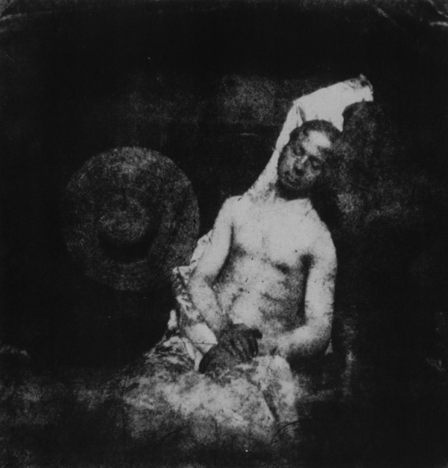
Narrative photography is an idea saying that photographs can be used to tell a story. Staged photography started early in history and has been carried out ever since. Staged photography involves a performance in front of the camera and it encourages studio portraiture and scenarios performed by characters directed or manipulated by the director. An example of this is the photograph below, the first ever staged photograph.                                      

Photograph Name: Self Portrait as a Drowned Man  
Photographer: Hippolyte Bayard
Date: 1840
Size: (550 × 538 pixels, file size: 293 KB, MIME type: image/jpeg)

This photo shows a depressing scene, showing that a man has pretended to commit suicide which gives off a negative atmosphere and could put viewers in a bad way.